Marketing Analytics Dashboards: Examples, Templates, and KPIs
Unlock the power of marketing analytics dashboards with practical examples, editable templates, and essential KPIs to drive your campaigns effectively.

Marketing Analytics Dashboards: Examples, Templates, and KPIs
A marketing analytics dashboard gives your team a single-pane view of how marketing activity connects to revenue, so you can act on what matters instead of chasing noise. This guide delivers exactly what you need to build one that works.
- Real-world examples by dashboard type (CMO, paid media, SEO, email, lead gen, A/B testing, and more), each with 6–10 KPIs, typical visualizations, and data sources
- Editable starter templates from Looker Studio, Power BI, Klipfolio, and Coupler.io, with a field-mapping example to speed setup
- A KPI framework for picking 1–2 North Star metrics per role, plus a step-by-step implementation checklist
- Decision intelligence notes on how a ranked recommendation layer moves teams from visibility to prioritized action
Success looks like this: your team opens one screen each morning, sees which campaigns need attention, and knows exactly what to change first.
Key Takeaways
A focused marketing analytics dashboard built around 1–2 revenue-linked North Star metrics per role, validated data sources, and a weekly action queue will outperform any comprehensive report that nobody acts on.
| Point | Details |
|---|---|
| North Star first | Pick 1–2 revenue-linked metrics per role before building; remove every metric that doesn’t change a decision. |
| Define before you build | Document every KPI’s formula, attribution window, and data source in a shared repository to prevent mismatched numbers. |
| Reconcile monthly | Compare dashboard totals against CRM revenue and platform billing reports; a variance above 2% signals a mapping error. |
| Tier your metrics | Organize KPIs into profitability, efficiency, and diagnostic tiers; show tier-one on the main view, hide tier-three in drill pages. |
| Getpaidlens for ranked actions | Getpaidlens connects ad platforms, GA4, and CRM, then ranks recommendations by expected impact so teams act on the right change first. |
Table of Contents
- What a marketing analytics dashboard actually does
- Dashboard types: real-world examples you can adapt
- How to choose your North Star metric by role
- Which data sources belong in your dashboard
- Dashboard layout and design best practices
- Step-by-step implementation checklist
- Common dashboard mistakes and how to fix them
- How decision intelligence moves you from visibility to action
- A practitioner’s perspective on what actually matters
- Getpaidlens turns your dashboard data into ranked recommendations
- Sources
What a marketing analytics dashboard actually does
A marketing analytics dashboard is a live, single-screen display that maps your marketing activity to revenue and surfaces the next action your team should take. Think of it like a car’s instrument cluster: the speedometer and fuel gauge give you the telemetry you need to drive safely, while the warning lights tell you what to fix. A well-built dashboard does the same thing, separating the “are we on track?” signals from the “something needs attention” alerts.
The design imperative that most teams miss: scope it ruthlessly. Ahrefs recommends picking 1–2 North Star metrics per role rather than tracking 30+ KPIs, because a dashboard that shows everything effectively shows nothing. Every metric you add competes for attention with the one that actually drives decisions.
Naming conventions matter just as much as metric selection. Before you build anything, write down the formula, attribution window, and data source for each KPI in a shared definition document. “Conversions” means something different in Google Ads, GA4, and your CRM, and a dashboard that mixes those definitions will mislead the people reading it.
Dashboard types: real-world examples you can adapt
Every marketing team needs a different view depending on what they own. Below are nine dashboard types, each with a clear purpose, recommended KPIs, visualizations, data sources, and a note on where to find a starter template. A compact comparison follows the examples.
CMO executive dashboard
Purpose: Give leadership a weekly revenue-linked summary across all channels, with trend lines and budget pacing.
Key KPIs: Marketing-sourced revenue, Marketing Efficiency Ratio (MER), blended ROAS, customer acquisition cost (CAC), pipeline contribution, marketing-attributed deals closed, budget pacing vs. plan, and return on marketing investment (ROMI).
Visualizations: Trend lines for revenue and MER, a waterfall chart for budget vs. actuals, and a scorecard row for CAC and ROMI.
Data sources: CRM (Salesforce, HubSpot), ad platforms (Google Ads, Meta Ads), GA4, and a finance feed for actuals.
Template: Looker Studio’s CMO Overview template is a solid starting point; map your CRM revenue field to the “revenue” dimension and your blended spend to the “cost” field.
Web and digital analytics dashboard
Purpose: Track site health, traffic quality, and conversion funnel performance in near real time.
Key KPIs: Sessions, new vs. returning users, bounce rate, pages per session, goal completion rate, conversion rate by channel, average session duration, Core Web Vitals scores, and top landing pages by revenue.
Visualizations: Funnel charts for the acquisition-to-conversion path, time-series for traffic trends, and a table for top pages sorted by conversion value.
Data sources: GA4 (primary), Google Search Console, and your CRM for revenue attribution.
Template: Google Looker Studio’s GA4 Web Overview template is free and pre-connected; add a Search Console data source for organic visibility metrics.
Social media dashboard
Purpose: Monitor organic and paid social performance across platforms and tie engagement to downstream traffic and conversions.
Key KPIs: Reach, impressions, engagement rate, follower growth rate, link clicks, click-through rate (CTR), cost per engagement (paid), video completion rate, and social-attributed conversions.
Visualizations: Bar charts for platform-by-platform reach comparison, trend lines for engagement rate, and a scatter plot of spend vs. conversions for paid social.
Data sources: Meta Ads (Facebook and Instagram), LinkedIn Campaign Manager, TikTok Ads, and GA4 for downstream attribution.
Template: Klipfolio offers a pre-built social media dashboard with connectors for Meta and LinkedIn; Coupler.io has a Google Sheets-based social template that pulls from multiple platforms automatically.
Google Ads and paid media dashboard
Purpose: Manage campaign efficiency, budget pacing, and ROAS at the account, campaign, and ad-group level.
Key KPIs: Impressions, clicks, CTR, average CPC, conversion rate, cost per conversion, ROAS, impression share, Quality Score, and budget pacing percentage.
Visualizations: Trend lines for ROAS and CPC over time, a heatmap of day-of-week vs. hour-of-day performance, and a table of campaigns ranked by ROAS.
Data sources: Google Ads (native connector in Looker Studio), Meta Ads, and GA4 for post-click behavior.
Template: Looker Studio’s Google Ads Overview template is pre-built and connects in two clicks; add a Meta Ads connector via Coupler.io or a partner connector to get cross-platform spend in one view.
Email marketing dashboard
Purpose: Track list health, campaign engagement, and email-attributed revenue across sends.
Key KPIs: Deliverability rate, open rate, click-to-open rate (CTOR), unsubscribe rate, list growth rate, revenue per email sent, conversion rate from email, and spam complaint rate.
Visualizations: Trend lines for open and CTOR over time, a bar chart comparing campaign performance, and a cohort table for list growth by acquisition source.
Data sources: Klaviyo, Mailchimp, HubSpot Email, or ActiveCampaign via native connectors or Coupler.io.
Template: Klipfolio has a Mailchimp dashboard template; for Klaviyo, Coupler.io’s Klaviyo-to-Sheets template pulls send-level data you can then visualize in Looker Studio.
SEO dashboard
Purpose: Monitor organic visibility, ranking trends, and the revenue contribution of organic search.
Key KPIs: Organic sessions, keyword rankings (top 3, top 10, top 100 buckets), click-through rate from search, impressions, domain authority trend, pages indexed, Core Web Vitals pass rate, and organic-attributed conversions.
Visualizations: Trend lines for sessions and impressions, a table of top keywords by clicks and position, and a bar chart of page-level organic revenue.
Data sources: Google Search Console (free Looker Studio connector), GA4, and a rank-tracking tool like Ahrefs or Semrush for keyword-level data.
Template: Google’s Search Console Looker Studio template is the fastest starting point; add GA4 as a blended source to connect impressions to on-site conversions.
Lead generation dashboard
Purpose: Track the full funnel from ad click to qualified lead to opportunity, with cost and velocity metrics at each stage.
Key KPIs: Leads generated, cost per lead (CPL), marketing-qualified leads (MQLs), MQL-to-SQL conversion rate, sales-accepted leads (SALs), pipeline value generated, lead velocity rate, and form completion rate by source.
Visualizations: A funnel chart from click to MQL to SQL, trend lines for CPL and MQL volume, and a table of lead sources ranked by MQL rate.
Data sources: GA4, Google Ads, Meta Ads, and your CRM (Salesforce or HubSpot) for pipeline and opportunity data.
Template: HubSpot’s built-in marketing dashboard covers MQL and pipeline metrics natively; for cross-platform lead gen, Coupler.io’s lead gen template pulls from multiple ad platforms into one sheet.
A/B testing dashboard
Purpose: Track live experiments, statistical significance, and the revenue impact of winning variants.
Key KPIs: Variant traffic split, conversion rate per variant, statistical confidence level, revenue per visitor, average order value by variant, and time to significance.
Visualizations: Side-by-side bar charts for conversion rates, a confidence interval chart, and a trend line showing cumulative conversions per variant.
Data sources: GA4 (Experiments), Optimizely, VWO, or AB Tasty, plus your CRM for revenue attribution.
Template: Most A/B testing platforms have native dashboards; for a cross-tool view, build a Looker Studio report pulling from GA4 experiment data and your testing platform’s API via Coupler.io.
Ecommerce and content dashboard
Purpose: Connect content performance to product revenue, tracking which pages and campaigns drive purchases.
Key KPIs: Revenue by channel, transactions, average order value (AOV), cart abandonment rate, product page conversion rate, content-attributed revenue, return on ad spend by product category, and customer lifetime value (LTV) by acquisition source.
Visualizations: A funnel from product page view to purchase, a scatter plot of content traffic vs. revenue, and a cohort table for LTV by acquisition channel.
Data sources: GA4 (ecommerce events), Google Ads, Meta Ads, Shopify or WooCommerce via native connectors, and your CRM for LTV data.
Template: Looker Studio’s ecommerce template (built for GA4 ecommerce events) is the fastest start; Coupler.io has a Shopify analytics template that pulls order and product data directly.
Dashboard type comparison
| Dashboard type | Best for / primary use case | Key KPIs shown | Data sources required | Typical visualizations | Refresh frequency |
|---|---|---|---|---|---|
| CMO executive | Leadership weekly review | MER, ROMI, CAC, pipeline | CRM, all ad platforms, GA4 | Scorecards, trend lines, waterfall | Weekly |
| Web analytics | Site and funnel health | Sessions, CVR, Core Web Vitals | GA4, Search Console | Funnels, time-series, page tables | Daily |
| Social media | Cross-platform engagement | Reach, engagement rate, CTR | Meta Ads, LinkedIn, TikTok | Bar charts, scatter, trend lines | Daily |
| Google Ads / paid media | Campaign efficiency | ROAS, CPC, impression share | Google Ads, Meta Ads, GA4 | Heatmaps, ROAS trend, campaign table | Daily |
| Email marketing | List health and revenue | CTOR, deliverability, revenue/email | ESP (Klaviyo, Mailchimp) | Trend lines, campaign bar chart | Per send |
| SEO | Organic visibility and revenue | Rankings, sessions, CVR | Search Console, GA4, rank tracker | Keyword table, impressions trend | Weekly |
| Lead generation | Funnel velocity and cost | CPL, MQL rate, pipeline value | GA4, ad platforms, CRM | Funnel chart, CPL trend | Daily |
| A/B testing | Experiment tracking | CVR by variant, confidence | GA4, testing platform | Side-by-side bars, confidence chart | Real-time |
| Ecommerce / content | Revenue by content and channel | AOV, LTV, cart abandonment | GA4, Shopify, ad platforms | Funnel, scatter, cohort table | Daily |
How to choose your North Star metric by role
Pick a revenue-linked North Star per role first, then build supporting metrics around it. HubSpot’s 2026 analysis confirms that top-performing marketing teams focus on a small set of revenue-linked KPIs and use centralized data to make faster decisions, rather than tracking dozens of vanity metrics.
Criteria for a good North Star metric: it must be directly actionable by the person who owns it, auditable from a single data source, tied to revenue or pipeline, and sensitive enough to move within a week.
Three role-to-metric mappings that work in practice:
CMO → Marketing Efficiency Ratio (MER). MER (total revenue divided by total marketing spend) is blended, platform-agnostic, and impossible to game with attribution tricks. Supporting metrics: ROMI by channel, CAC trend, and pipeline contribution by source. Why it matters: MER moves when the portfolio shifts, not just when one campaign wins.
Performance marketing manager → New-customer ROAS. Blended ROAS hides the cost of retargeting existing customers. New-customer ROAS isolates acquisition efficiency. Supporting metrics: CPL, impression share, and budget pacing. Why it matters: a team optimizing blended ROAS can hit their number by spending more on warm audiences while acquisition quietly stalls.
Content lead → Conversion rate to MQL. Traffic volume is a vanity metric unless it converts. MQL conversion rate ties content output to pipeline. Supporting metrics: organic sessions, time on page, and assisted conversions. Why it matters: it forces content decisions to connect to revenue, not just pageviews.
Pro Tip: Document every metric with a four-field definition: formula, attribution window, data source, and owner. Example for “New-customer ROAS”: (Revenue from first-time buyers attributed to paid media in a 7-day click / 1-day view window, sourced from GA4 purchase events matched to CRM new-customer flag, owned by the performance manager). Without this, two people reading the same dashboard will reach different conclusions.
Which data sources belong in your dashboard
Every marketing analytics dashboard needs these six source categories: GA4 for on-site behavior and conversion events, Google Ads for paid search spend and performance, Meta Ads for paid social, your CRM (Salesforce or HubSpot) for pipeline and revenue, an attribution or data warehouse layer for cross-channel reconciliation, and a product analytics tool (Amplitude, Mixpanel) if you track post-signup behavior.
AgencyAnalytics recommends connecting ad platforms, email, and analytics into unified dashboards and automating reports to prove performance to clients. The connector choice determines how reliable your data will be.
Connector tradeoffs:
- Native connectors (Looker Studio’s built-in Google Ads and GA4 connectors, Power BI’s certified connectors): fastest to set up, zero cost, but limited to the fields the platform exposes and subject to API rate limits.
- ETL platforms (Fivetran, Stitch, Airbyte): pull raw data into a warehouse (BigQuery, Snowflake), giving you full schema control and historical backfill. Higher setup cost, but the right choice when you need cross-channel joins or custom attribution.
- Spreadsheet-based connectors (Coupler.io, Supermetrics): pull platform data into Google Sheets or Excel on a schedule. Good for small teams or agencies that need quick multi-platform views without a warehouse.
- Server-side tracking: captures events your client-side tag misses (ad blockers, iOS restrictions). Reduces data loss in GA4 and improves conversion modeling accuracy.
Data quality checklist before you build:
- Confirm schema consistency: field names and data types match across sources (e.g., “campaign_id” is the same string format in Google Ads and your CRM).
- Align attribution windows: decide on a single window (e.g., 7-day click, 1-day view) and apply it consistently across all platforms.
- Standardize timezones and currency: all platforms should report in the same timezone and currency before aggregation.
- Deduplicate conversions: a purchase reported in Google Ads, Meta Ads, and GA4 is one purchase. Use your CRM or warehouse as the source of truth for revenue.
- Flag sample-size issues: GA4 samples data in some reports; use unsampled exports via BigQuery for high-stakes decisions.
- Map campaign IDs: tag every campaign with a consistent UTM structure so you can join ad platform spend to GA4 sessions and CRM opportunities.
Attribution model note: platform-reported attribution (last-click in Google Ads, view-through in Meta) almost always overstates each platform’s contribution. A blended or data-driven model in your warehouse, or a dedicated attribution layer that audits cross-channel overlap, gives you a defensible single source of truth. For data governance and security at scale, enterprise teams should also review their platform’s security and data protection policies before centralizing sensitive revenue data.
Microsoft Power BI and Microsoft Fabric provide an enterprise-ready stack for teams that need governed metrics, semantic models, and embedded reports across business units, with OneLake as a unified data layer and Copilot for conversational exploration.
Dashboard layout and design best practices
Every dashboard should answer one question the viewer needs to act on, visible in a single screen without scrolling. That is the design test. If you cannot name the question, you have not scoped the dashboard correctly.

Layout by audience
CMO executive view: Three to five scorecard tiles at the top (MER, ROMI, CAC, pipeline, budget pacing), followed by two trend lines (revenue and blended ROAS over 13 weeks), and a single table of channel-level performance. No drill-down required. The CMO should be able to read this in 90 seconds.
Campaign manager tactical view: Daily performance table sorted by ROAS, a budget pacing bar for each campaign, and a day-of-week heatmap for CTR and conversion rate. This view changes daily and drives budget reallocation decisions.
Analyst drill page: Full funnel breakdown, cohort tables, A/B test results, and anomaly flags. This is where hypotheses get tested, not where decisions get made. Link it from the tactical view rather than embedding it in the main dashboard.
Visualization dos and don’ts
Use trend lines for metrics that change over time (ROAS, CPL, sessions). Use bar charts for comparing discrete categories (campaigns, channels, ad groups). Use funnel charts for conversion path analysis. Use scatter plots to find the relationship between spend and return across campaigns.
Avoid pie charts for more than four categories; the human eye cannot accurately compare slice sizes. Avoid dual-axis charts unless both axes share the same unit or the relationship between them is the explicit point. Never use a stacked bar chart to show a metric that should be read as a total, not a composition.
Cadence and alerting
- Daily diagnostic check: ROAS, spend pacing, and conversion volume. Set automated alerts when ROAS drops more than 20% day-over-day or spend pacing exceeds 110% of daily budget.
- Weekly efficiency review: CPL trends, MQL rate, channel mix, and A/B test progress. This is the meeting where budget shifts get decided.
- Monthly profitability review: MER, CAC payback period, LTV by cohort, and channel-level ROMI. This is where strategy changes.
Pro Tip: Build a single-pane executive dashboard and link it to deeper analyst pages rather than cramming everything into one view. The executive dashboard should never require a scroll; the analyst page can be as deep as it needs to be. Linking them keeps the signal clean for decision-makers while giving analysts the detail they need.
Step-by-step implementation checklist
Follow this ordered checklist to go from idea to a production dashboard your team will actually use.
- Define objectives and owners. Write one sentence describing what decision this dashboard supports and who is responsible for acting on it. Assign a dashboard owner before you write a single query.
- Map metrics and sources. List every KPI, its formula, its data source, its attribution window, and its owner. Use a shared spreadsheet or Notion doc. No metric goes on the dashboard without a completed definition.
- Audit data quality. Run the six-point data quality checklist from the previous section. Fix schema mismatches and timezone inconsistencies before building.
- Build your ETL or connector layer. Set up native connectors for simple single-platform dashboards. For cross-platform views, configure Fivetran, Airbyte, or Coupler.io to land data in BigQuery or Snowflake. Use the Paid Lens connections page as a reference for ad platform and GA4 connector options.
- Create a canonical schema. Standardize field names, data types, and grain (daily, campaign-level) in a transformation layer (dbt or a SQL view). This is the layer that makes joins possible.
- Build visualizations. Start with the North Star metric tile, then add supporting metrics. Use the layout guidance above: executive view first, drill pages second.
- Run validation tests. Three tests to run before launch:
- Reconciliation check: compare total spend in your dashboard against the platform’s native billing report. Variance above 2% signals a mapping error.
- Sample-level check: pull a single campaign’s conversions from your dashboard and compare to the platform’s campaign report for the same date range.
- Conversion path sanity check: verify that a known test conversion (a real purchase or form fill you made yourself) appears in the dashboard within the expected refresh window.
- Roll out and train. Share the dashboard with a small group first. Run a 30-minute walkthrough covering what each metric means, how to read the alerts, and who to contact when something looks wrong.
- Schedule maintenance. Set a quarterly metric audit to review whether the North Star metrics still reflect the team’s goals. Log every schema change in a version-controlled change log.
Ownership table
| Role | Responsibility |
|---|---|
| Dashboard owner | Maintains metric definitions, approves schema changes, runs quarterly audits |
| Data engineer | Manages ETL pipelines, monitors connector health, updates canonical schema |
| Alert responder | Reviews daily diagnostic alerts, escalates anomalies within 24 hours |
| Cadence owner | Schedules and facilitates weekly efficiency and monthly profitability reviews |
| Training lead | Onboards new team members, maintains the metric definition playbook |
For executive reporting exports, the Paid Lens reporting feature supports Excel and PowerPoint outputs so dashboard owners can deliver client-ready or board-ready summaries without manual reformatting.
Where to find editable starter templates
The fastest path to a working dashboard is a pre-built template you map your own fields to, rather than building from scratch.
Looker Studio: Google’s template gallery includes free, pre-connected templates for GA4 Web Overview, Google Ads Overview, and Search Console. Copy the template, connect your own data sources, and replace the sample dimensions with your field names. For the GA4 ecommerce template, map the purchase event to the “revenue” metric, use item_id as the product SKU dimension, and set your attribution model in the GA4 property settings before connecting.
Microsoft Power BI: The AppSource marketplace has certified starter packs for Google Ads, Salesforce, and HubSpot. Power BI’s semantic model layer lets you define governed metrics once and reuse them across reports, which is the right approach for enterprise teams with multiple dashboard consumers.
Klipfolio: Offers pre-built dashboards for Google Ads, Meta Ads, Mailchimp, and LinkedIn with native connectors. The template library shows you exactly which metrics are pre-built and which fields you need to map. Good for agencies managing multiple client accounts.
Coupler.io: Specializes in pulling platform data into Google Sheets or Looker Studio on a schedule. Templates for Shopify, Klaviyo, Meta Ads, and LinkedIn are available in the template library. Before going live, load sample data, verify row counts match the platform’s native report, and check that date filters apply correctly.
Permissions note: when sharing a Looker Studio template, use “view only” access for stakeholders and “edit” access only for dashboard owners. Test the template with sample data before connecting live accounts to avoid exposing sensitive campaign data during setup.
Zoho Analytics also provides marketing dashboard examples and templates with connectors for common ad platforms and CRMs, useful as a reference for teams evaluating additional visualization options.
Common dashboard mistakes and how to fix them
The most frequent dashboard failures are: too many KPIs, mismatched metric definitions, vanity metrics masquerading as performance signals, attribution double-counting, stale data nobody trusts, and dashboards built for the builder rather than the decision-maker.
Too many KPIs. The fix is a tiered scorecard. Martech Pulse recommends organizing metrics into three tiers: profitability (MER, ROMI, CAC payback), efficiency (ROAS, CPL, conversion rate), and diagnostic (impression share, Quality Score, bounce rate). Show tier-one metrics on the main view; hide tier-three metrics in a drill page.
Mismatched metric definitions. A team that defines “conversion” differently in Google Ads, GA4, and their CRM will see three different numbers for the same event. The fix: a shared metric definition document, reviewed before every dashboard build, with the formula, attribution window, and data source written out for each KPI.
Vanity metrics. Impressions, follower counts, and raw pageviews feel good but rarely connect to revenue. Replace them with metrics that have a denominator: conversion rate, revenue per session, cost per MQL.
Attribution double-counting. When Google Ads and Meta Ads both claim the same conversion, your blended ROAS looks better than it is. The fix: use your CRM or warehouse as the revenue source of truth and reconcile platform-reported conversions against it monthly.
Stale or broken data. A dashboard nobody trusts gets ignored. Set up connector health alerts (most ETL platforms support this) and add a “last refreshed” timestamp to every dashboard. If the timestamp is more than 24 hours old, the alert fires.
Built for the builder, not the viewer. Analysts sometimes build dashboards that answer their own questions rather than the decision-maker’s. The fix: write the decision question at the top of the dashboard spec before building anything, and test the finished dashboard with the intended viewer before launch.
A reconciliation check revealed that a UTM parameter was missing from one campaign’s landing page URL, causing GA4 to attribute those sessions to direct traffic while Google Ads still claimed the conversions. Fixing the UTM tag and reprocessing the historical data corrected the discrepancy within 48 hours.
Bake prevention into your process: maintain a metric definition repository, run a monthly reconciliation check against CRM revenue, and schedule a quarterly dashboard audit to remove metrics nobody acts on.
How decision intelligence moves you from visibility to action
Dashboards show status. Decision intelligence recommends prioritized actions tied to expected business impact. That distinction is where most teams leave money on the table.
A decision intelligence layer tells you why it dropped, ranks the three most likely fixes by expected incremental revenue, and assigns a confidence score to each recommendation. The team acts on the highest-confidence fix first, measures the result, and moves to the next.

The system analyzes historical performance, spend patterns, and conversion timestamps to rank the top changes by expected incremental revenue. The campaign manager reviews the ranked queue, applies the highest-impact change (a bid adjustment or creative swap), and the system tracks the outcome against the expected lift. That loop, repeated daily, compounds into measurable efficiency gains over a quarter.
This is meaningfully different from reporting. Reporting is backward-looking. A recommendation layer is forward-looking: it uses clean spend data, conversion timestamps, LTV assumptions, and controlled experiment history to estimate what will happen if you make a specific change.
Pro Tip: For reliable impact estimates, you need four data inputs: clean spend with no gaps or double-counting, conversion timestamps (not just totals) so the system can model decay, LTV assumptions by acquisition cohort, and a history of controlled experiments to calibrate the model. Without experiment history, impact estimates are directionally useful but not precise. Start logging experiment results now, even in a simple spreadsheet, so the model has signal to learn from.
Platforms like Bricks advertise AI-driven attribution analysis and funnel visualization as part of their analytics offering. A more meaningful capability is a ranked recommendation queue that connects anomaly detection to a specific, auditable action. This is what separates a decision intelligence layer from a smarter reporting tool.
A practitioner’s perspective on what actually matters
Most marketing teams build dashboards that answer the wrong question. They optimize for comprehensiveness, adding every metric the platform exposes, and end up with a report nobody reads because it takes 20 minutes to interpret. The dashboards that actually change behavior are the ones that answer one question per audience, load in under three seconds, and have a clear “what do I do next” signal on the first screen.
Three quick wins you can apply this week:
- Set one North Star metric per role and remove every metric that doesn’t directly support it. If a metric doesn’t change what you’d do, it doesn’t belong on the main view.
- Add a nightly reconciliation test that compares your dashboard’s total spend and conversions against each platform’s native report. A variance above 2% triggers an alert before anyone presents bad numbers in a meeting.
- Create a weekly action queue: after the weekly efficiency review, write down the top three changes the dashboard is telling you to make, assign an owner to each, and check them off the following week. The queue is what turns a dashboard from a reporting artifact into a decision tool.
On training: a 60-minute onboarding session covering metric definitions, how to read alerts, and who owns each KPI is more valuable than any documentation. Pair it with a one-page metric definition playbook that new team members can reference when a number looks wrong.
Getpaidlens turns your dashboard data into ranked recommendations
Most teams have the data. What they lack is a clear answer to “what should we change first?” Getpaidlens connects your ad platforms, GA4, and CRM into a validated, cross-platform view, then ranks every recommended action by expected business impact and confidence score, so your team spends time executing the right changes rather than debating which number to trust.
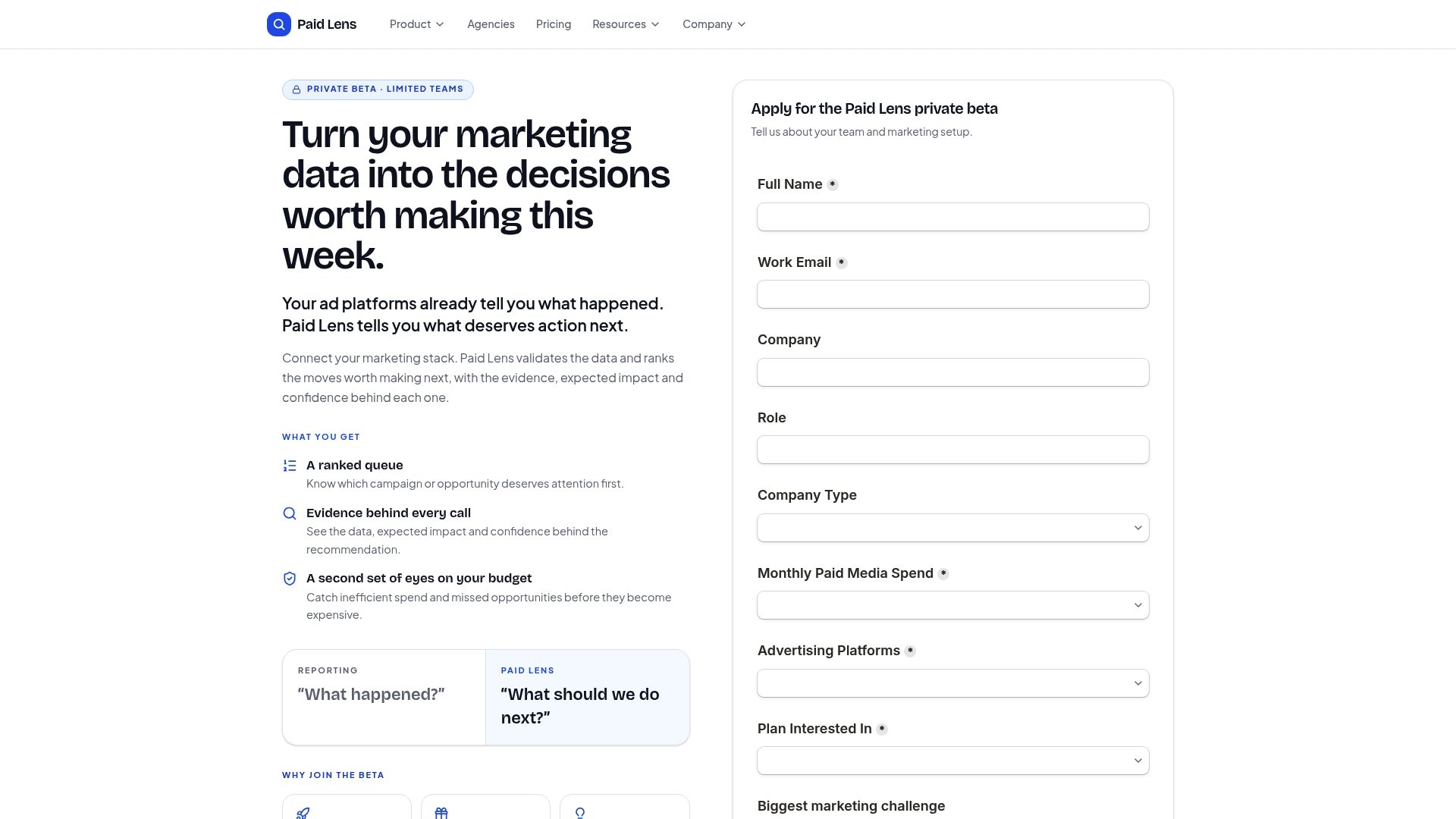
Here is what that looks like in practice: Getpaidlens detects a ROAS anomaly in your Google Ads account, cross-references it against Meta Ads spend and CRM revenue, and surfaces a ranked list of budget and bid adjustments ordered by expected incremental revenue. Each recommendation includes the evidence behind it and a confidence score, so the campaign manager knows whether to act immediately or monitor for another day. The AI analyst lets you query your data in plain language: “Which campaigns drove the most new-customer revenue last week?” gets you an answer in seconds, not a pivot table.
Getpaidlens is currently in private beta. See the pricing and plans or request early access to see the ranked recommendation workflow with your own data.
Sources
Start with the Looker Studio template gallery if you need a working dashboard today; open the Ahrefs KPI guide if you are still deciding which metrics to track.
- How successful marketing teams are optimizing performance in 2026 (and what metrics they’re tracking)
- Marketing KPIs: 30 Metrics for Every Marketing Role
- Marketing performance monitoring: Metrics, tools & best practices - AgencyAnalytics
- Performance Marketing Metrics That Actually Matter - Martech Pulse
- What is Marketing Dashboard? | Definition & Examples - Zoho